Using Quiver to visualize a Keras CNN
Debugging a neural network is tricky. CNNs are a little bit more “understandable” because we can look which features of an image activates different neurons.
The following video is from the CS231n class of 2017 held by Justin Johnson where he talks about the available ideas.
Visualizing activations (minute 22 in the video) seems to be a really interesting thing. It works by highlighting what results in a high value after convolving over the image.
I found the tool Quiver (https://github.com/keplr-io/quiver) which offers exactly this functionality for Keras models.
Setup
I assume you have Keras installed. Now we add the quiver_engine:
python3 -m pip install --user git+git://github.com/keplr-io/quiver.git
Now we need the Keras model to load. The model was trained with the following command:
model.fit(X_balanced, Y_balanced,
          batch_size=batch_size,
          epochs=epochs,
          validation_split=0.2,
          callbacks=[LearningRateScheduler(lr_schedule),
                     ModelCheckpoint('model.h5', save_best_only=True)]
          )
As you can see, the best model was dumped. That means that the model.h5 contains the model structure and also its weights.
Loading the model in another python module is super easy:
from keras.models import load_model
model = load_model('model.h5')
The only thing that is missing are the names of the classes:
classes = ['20', '30', '50', '60', '70', '80', '80 finished', '100', '120', 'links überholen für PkWs verboten',
  'links überholen für LkWs verboten', 'Vorfahrt', 'Vorfahrtsstraße', 'Vorfahrt achten', 'STOP', 'Keine Durchfahrt',
  'Keine Durchfahrt für LkWs', 'Keine Einfahrt', 'Achtung', 'Vorsicht Linkskurve', 'Vorsicht Rechtskurve',
  'Vorsicht kurvige Straße', 'Vorsicht unebene Straße', 'Vorsicht unsichere Spurführung',
  'Vorsicht Fahrbahn rechts verengt', 'Vorsicht Baustelle', 'Vorsicht Ampel', 'Vorsicht Fußgänger',
  'Vorsicht spielende Kinder', 'Vorsicht Fahrradfahrer', 'Vorsicht Schneeflocke', 'Vorsicht Wild',
  'Geschwindigkeitsbegrenzung aufgehoben', 'Rechtsabbiegen', 'Linksabbiegen', 'Geradeausfahren',
  'Geradeaus- oder Rechtsfahren', 'Geradeaus- oder Linksfahren', 'Rechts einfahren', 'Links einfahren', 'Kreisverkehr',
  'Überholverbot für PkWs aufgehoben', 'Überholverbot für LkWs aufgehoben'
]
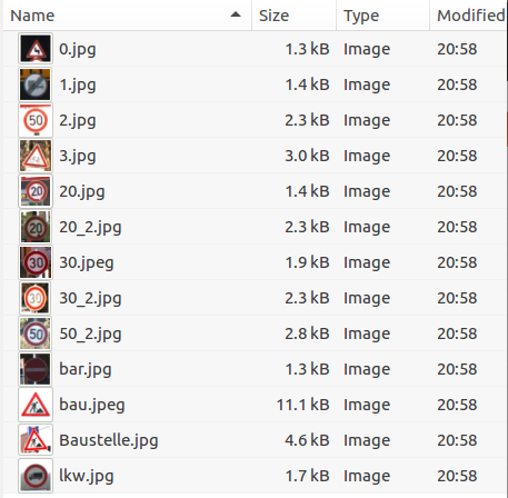
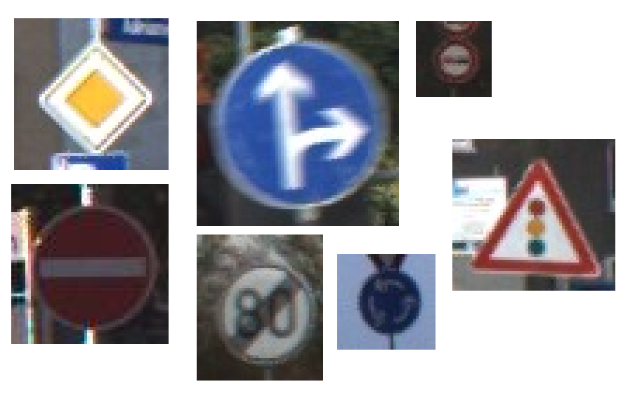
And a directory containing images that we want to analyze:
That’s already the necessary setup. The following snippet starts the quiver_engine which is a react-app served by a flask server.
from quiver_engine import server

show_top_n_predictions = 5

server.launch(
	model,
    classes,
    show_top_n_predictions,
    temp_folder='./tmp',
    input_folder='./example_images/',
    port=5000
)
Let us see
Quiver really worked out of the box for me which is amazing because I did not take care of scaling the images or anything else. Scaling the images was not even part of my Keras model, it happened in custom numpy code.
I imagine this is how apple customers feel. Good looking software that just works out of the box! ;)
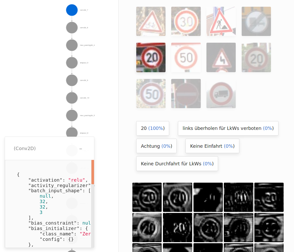
Going through all layers
Conv1
With Quiver I can click on a layer in my network and instantly get a black grayscale image activation map.
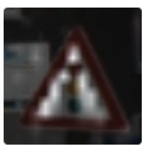
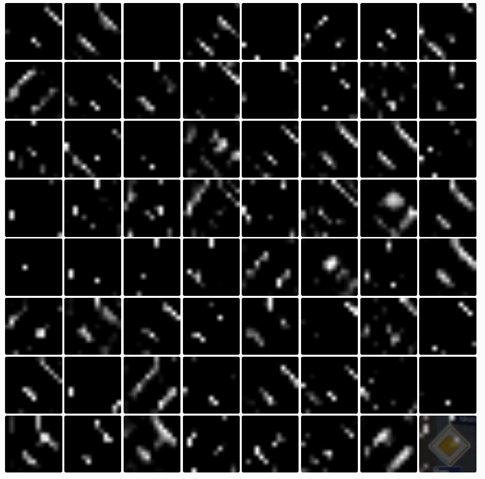
The first convolutional layer already shows nice results. The following image shows the activation of filter 6 for different images. It really focuses on red, thick borders. Maybe only the round ones.
The two lower images show that white and grey don’t activate but the orange background does.
Conv2
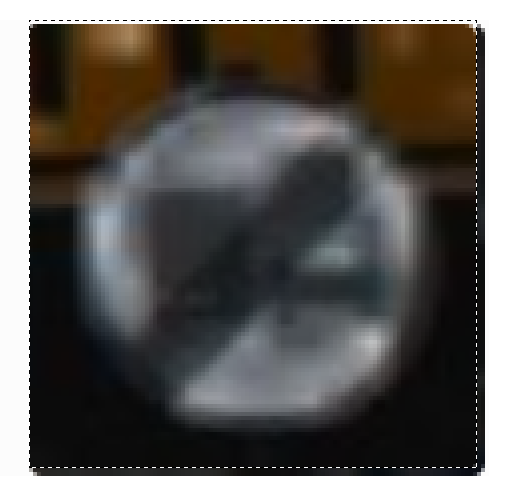
Some filters don’t activate at all. I assume that these are the filters that work with traffic signs of other colors.
I tried all of the following images and more. But the three neurons stayed black. Unfortunately I cannot dive deeper into this issue with quiver but if these are dead neurons then we already found an issue.
The receptive field of the second layer is a little bit bigger so the kernel can “see” more than 3x3 pixels. This might be a reason why the some filters show lines in one direction and others in the other direction:
Max pooling
The effect of this layer reminds me of the “dilate” function I used in opencv2.
(This layer is followed by dropout in training mode but that is not interesting for the visualizations because we are not dropping any connections now.)
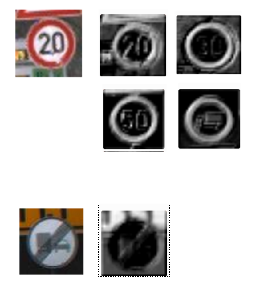
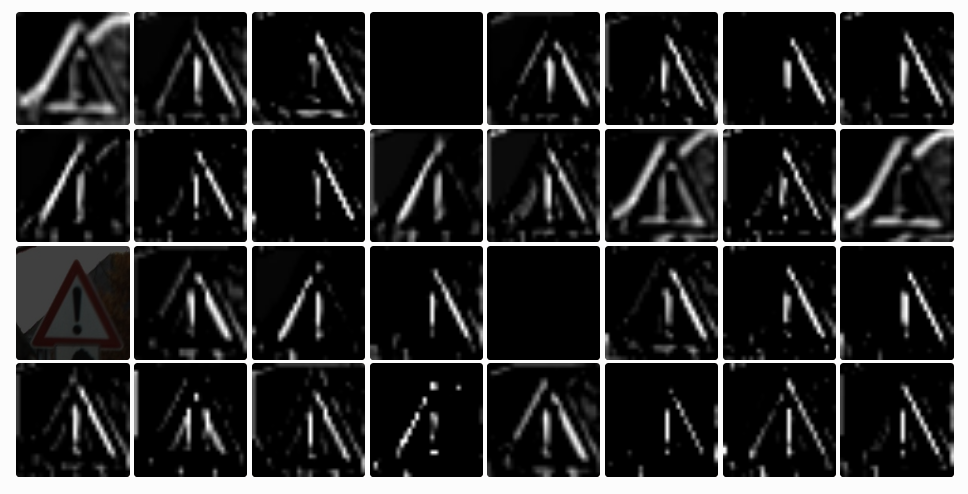
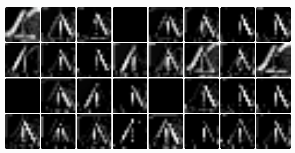
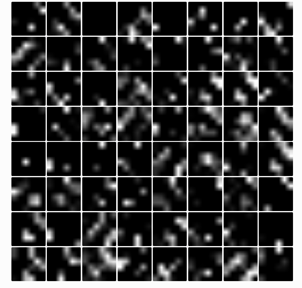
Conv3
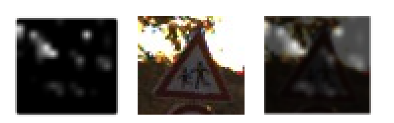
At this stage we have 64 filters. The following image shows the activations for the semaphore sign. It feels like triangles are highlighted. And when I compare some of the white dots with the image, there is a group of them having white areas behind them. Maybe the signs are recognized by the white spaces in the sign?
For example the following image has attention exactly on the white patches around the colored circles of the semaphore.
The same filter highlights white patches on other signs.
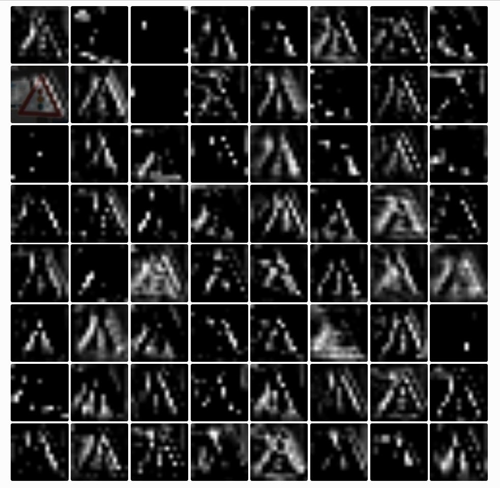
To test this hypothesis I picked with a nearly white background and bad light conditions of the sign so it appears to be muddy grey.
The activitation are white batches on the background and a few on the sign.
It is interesting to note that this image was misclassified. This fact reinforces the thesis with the white patches. Every sign contains them even if their main colors are blue, red or grey.
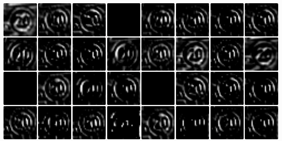
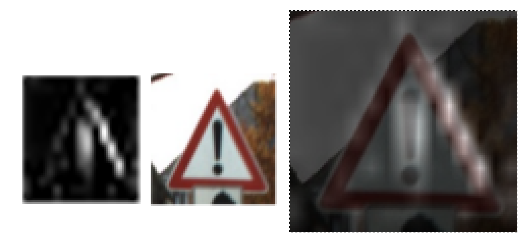
But it is also possible to find example where black pixels are highlightes. At this stage there is a filter which highlights the triangular shape and the exclamation mark of the “attention” sign:
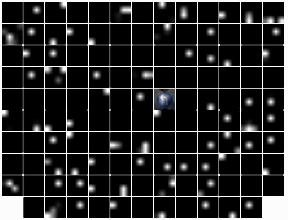
Conv4
The activations are becoming more sparse. Some of them filter good edges:
Max Pooling 2
I have got nothing interesting to say about this.
Conv5
Puh… hard to say anything.
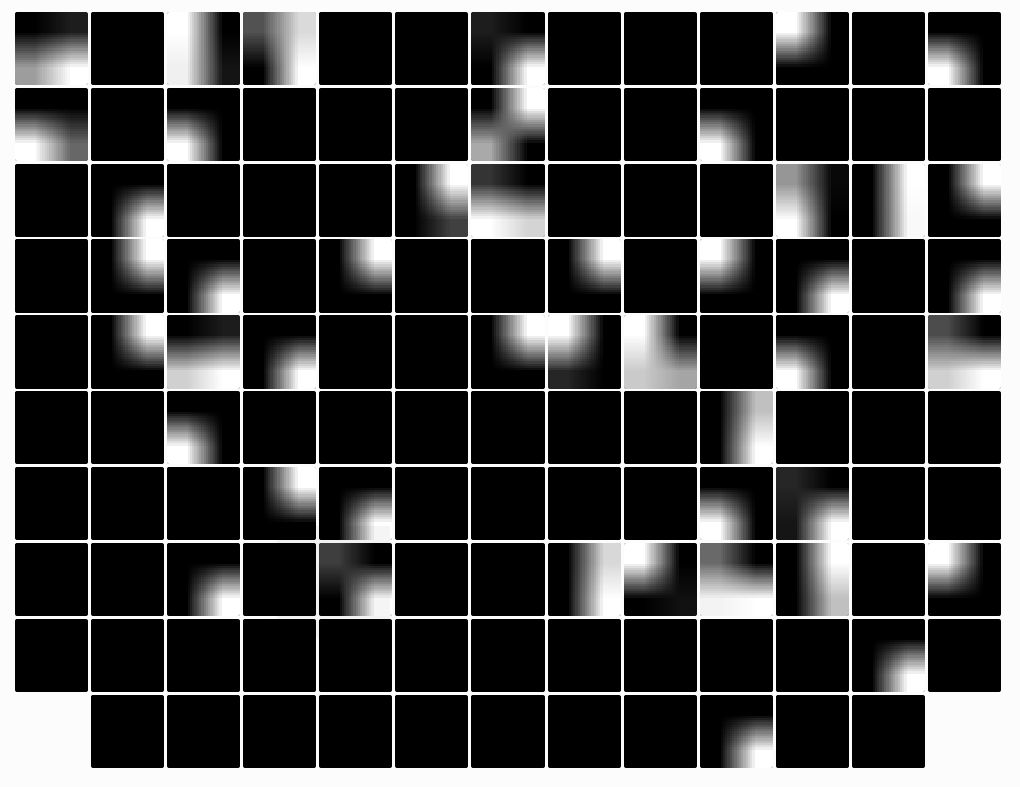
Conv6
This is the last convolutional layer. A lot of filters a black. Most of the active ones form 1, 2 or 3 small circles.
It differs from sign to sign which filter is active.
Max Pooling 3
The last max pooling shows activations that look like images made by somebody who just discovered the gradient tool in photoshop…
Take away
These are my immediate thoughts after looking into the different activation maps for the images:
- hmmm
- hmmm
- dead filters in the second conv?
- color normalization?
- Quiver is cool but I would like to see some deepdream-like features in order maximize to what features which class responds
- Are the images too small?
(come back later to read further thoughts…)